Wednesday, April 12, 2017

Vexilolligy - The Various Flags of Stolzonia

Scan of the Hand-Drawn
Double Headed Eagle
This last week I spent primarily working on the design of the Imperial Flag of Stolzonia. After nearly giving up, an idea came to mind of how to properly design the Double Headed Eagle within Illustrator. I started with hand drawing the Eagle, and then scanning it onto the computer to trace it in illustrator, simply using the pencil tool so it would have a more 'natural' look to it, rather than being perfectly round and artificial looking. I eventually ended up completely re-designing the eagle in the centre of the flag, giving it a look heavily inspired by the double headed eagle of the Holy Roman Empire.  I was highly satisfied with the end result, and also learned a few new tricks about Illustrator along the way as well.


Original Pixel Flag of the Empire of Stolzonia

Holy Roman Empire Eagle

New Version of the Imperial Stolzonian Flag
PNG created from Vector export in Illustrator
I also decided to re-create the flag of the Church of Stolzonia, which has a rather simple design, but wanted to make it into a Vector version as well. I also created several alternate colored versions of the Stolzonian Flag that represent the Five Branches of the Stolzonian Military (Army, Navy, Air Force, Homeland Defense, Logistics).

Civil Flag of Stolzonia
Flag of the Church of Stolzonia
Flag of the Imperial Army
Flag of the Imperial Navy
Flag of the Imperial Air Force
Flag of the Imperial Homeland Defense
Flag of Imperial Logistics

Tuesday, April 4, 2017

Vexillology - Research

I took this last week to do more in-depth research into flags, and what makes a "good" flag. Of all the nations in the world, there are only two instances in which multiple countries have identical flags, meaning that there are, in modern day, over 200 unique flags to represent the independent nations of the world. Add to that the number of flags that exist for sub-divisions, states, provinces, cities, counties, and the number skyrockets. However, when you go into these sub-divisions of nations the likelihood for a set of identical or very similar flags increases. Look at the US State Flags for instance:
Source: Wikipedia
Over half of these flags are simply a single colour background with the specific State's Seal on it, and maybe the name of the state under it, and most of those are also on a dark blue background as well, making the similarity even more. Many of these flags you probably cannot differentiate from the others without looking closely at them - to read the name off of the flag.

So, what makes a good flag then? Well its rather simple really. The best flags are unique, and also very easy to identify from a distance. A flag should pop out, you should be able to look at a flag and say "Ah yes, that is [country]," without having to sit and think if it is another country. Unfortunately that already is a common issue on the international level as well. A good example of several nations that have very similar flags would be the countries of Central America. To be specific: Guatemala, El Salvador, Honduras, and Nicaragua all have very similar flags: two blue stripes and one white stripe with some symbol in the middle. Obviously, a trained eye would be able to spot out the differences easily, but from a far distance and to an untrained eye they all appear very similar. These common flags are often a result of the nations all having a common cultural group, or common origin, like those central american nations previously listed.

That's about all for today. Progress on the Imperial Stolzonian flag has been halted indefinitely, as drawing a double-headed eagle has turned out to be much more complex than I had originally thought. In the meanwhile I decided to make a "coat-of-arms" style version of the Stolzonian Flag.


Tuesday, March 28, 2017

Vexillology - The Study of Flags - The Flag of Stolzonia

It's time for our final project, anything of our choosing that we are particularly interested in. For me? Vexillology and Vexillography, the study and design of flags. For a long time I have had a deep interest in the subject of flag design and finally have the opportunity to explore deeper into the subject. I will use this project not only to research and study existent flags, but also to create and design my own flags and logos for fictional countries and organizations, primarily using Adobe Illustrator.

The Flag of Stolzonia

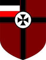
The Kingdom Stolzonia is a fictional country that I created about a year ago. The country has a very strong Germanic influence and is lead by a Monarch who holds executive power and an elected legislative Council similar to the US Congress. I had originally created the flag using MS Paint, so it looked very pixelated and blocky even seeing it from a distance. The design however I liked very much, and decided that I wanted to create a vector graphic version of the same flag.
Original png of the Stolzonian Flag
Most of the design of the flag was simple shapes, rectangles and one circle. The Cross in the centre soon brought up difficulties however. It took some time for me to figure out the issue and after searching around online I discovered an explanation of how exactly to get what I needed. Using the pen tool and it's ability to make curves I was able to make the nice, smooth and geometric curve that I needed to make the desired shape. The flag ended up coming out perfectly and I am highly satisfied with the result.
New Enhanced, Vector-Based Flag

What's Next?

Later on in the history of Stolzonia, the government became an Imperial government, with a much more complicated flag. I hope to create a smooth vector graphic version of this flag next, with the much more complicated symbol of the Double Headed Eagle in the centre.
Original of the Imperial Flag

Tuesday, December 20, 2016

Portfolio Project

Recently we were tasked with the goal of creating a portfolio website. This project has spanned the period of about a month and in that time we had several different smaller side-projects that were used to help us in designing our own portfolio website.

Before we actually began to look at our own websites, we went through and looked at how to create a job resume, as part of the portfolio is presenting yourself to potential clients, and so the portfolio is in a way also a resume. This was important in showing that even if we don't have much professional work environment skills, its important to list any personal skills or talents that you might have as well on a resume to make yourself look better to your potential clients and to accurately display your abilities.

After we finished looking at how to create a resume, we then looked into other people's portfolio websites to see what kind of information they displayed on their websites and to look at the design aspects of their portfolios. Each of these websites were of course different, and most of the time they seemed to focus more on displaying past work rather than information about the people who made the website. This shows how the primary purpose of a portfolio website is more to display your past works to try and convince your potential clients of what you are capable of doing for them, in addition to listing your possible skills and past work experiences.

Once we had learned how to create our own resume and seen how other people had created their portfolios, our task had finally fallen to creating our own portfolio website. To be blatantly honest, I have not finished mine. I let distractors into my life and didn't work when I should have, a major mistake that I have learned from. Regardless I can still talk of the process needed to make this site and what I can reflect upon it already. The first thing that was needed for the website was to create a logo for ourselves. After a long period of deliberation and trying to think of anything that I could possibly make to describe myself, I finally came up with the idea of using an Eagle with my initials. Something that would look unique, be simple, and be fitting to who I am. The next part was to create a "tagline" for myself, which is something that I have been heavily struggling with and I seem to be unable to think of one. Of course after all of that, the next part is to create our portfolio in DreamWeaver, make our own unique design, present our content, and tell about ourselves. I'm not quite done as of the time of writing this. I've been working on trying to think of how to design my site and what information to tell about myself and what projects to share, and have been hitting several mental roadblocks on the way.

I hope that over this Christmas Break I'll be able to relax and recollect myself, and that by next semester I'll be refreshed and ready to go. I'm hoping next semester I'll be able to get a fresh start and not fall behind again like I did this semester, and get a better grip on controlling and keeping distractors out of my schoolwork.

Merry Christmas!

Monday, September 12, 2016

My Teacher just told us that it's ok to Plagiarize

Everything is plagiarized. An interesting idea that might hold some truth to it. In the strange book Steal Like an Artist, Austin Kleon throws conventional ideas about art out the window and replaces them with this new perspective. He puts to head the argument that nothing anyone creates is truly original. This argument is interesting and perhaps holds some truth to it.

To a point, I can agree with Kleon in this argument, he says that everything we create is still in some way based upon the ideas and creations that others have had before us that we are taking and changing to make into different or better ideas. Instead of trying to distance ourselves from taking ideas from other creators Kleon says we should instead dive deeper into the creators we do appreciate and the people that they loved, and learn and take ideas from their creations and shape them into our own. Kleon isn't telling us to literally go out and copy a news article or a painting or some piece of art, but showing that no matter what we do, other creators will have a heavy impact on the way that we create, and that in the end we are effectively 'stealing' the ideas from these other creators.

This is an interesting idea. Certainly it relieves a lot of pressure on newer writers and creators who are too worried that they are going to be 'stealing' the ideas of their favourite creators, as I know how that feels to worry about. It's an interesting and well explained argument.

Tuesday, January 26, 2016

Element Inspector


Assuming you haven't scratched your eyes out from the sight of comic sans, in this post I will be going to some professionally designed websites and looking at the actual HTML and CSS code that makes the websites look the way they do, and trying to figure out how they work.


The first site I will be going to to look at for elements is a site titled "If the Moon Were Only 1 Pixel". Unfortunately for those viewing this from school internet, the site is blocked for some reason (Personal Website content?) It is a very interesting website that shows a scale model of the solar system, truly depicting the amount of SPACE that is in between all of the planets in our solar system. The website even has a feature that lets you cruse along at a scaled speed of light, meaning it takes 8 minutes to get from the sun to the Earth, half an hour to Jupiter, and two hours to get to Pluto.


Of course, it would be very tedious to have to scroll all the way to every single planet when you just want to quickly look at the planets, and see how they compare to each other in size. At the top, there is a navigation bar that allows you to click on any of the icons that symbolize the planets, allowing you to jump to the planet, as you can see in the image to the left. The way this work appears to be simple, and I will explain it to the best of my ability.

Peering into the jumble of code present to create this site, I found the Navigation bar in the code, a simple list of links all named for a div. When the user clicks one of these icons, it jumps to the location of the "div" that is placed where that planet is on the chart. In the pair of images below you can see I have boxed out the table where it displays the links, and also the divs themselves, and underlined the names of the divs.

----------


The site also displays the would-be distance from the sun at the bottom. Interestingly, it allows you to choose from a variety of different units to display the distance in. This is from a small dropdown (or i suppose up?) menu that pops up when you click on the distance at the bottom. Selecting any of these causes the website to use some black magic javascript voodoo that I don't know entirely how works. Although, I do have a decent understanding of basic logic structure in coding, and can try to the best of my abilities to explain it.


Above is the actual code from the HTML, it doesn't reveal much about the inner workings of the site, but it is there nonetheless, and vitally important.

Above is the ultimate terror that is Javascript. from what I can see from it, it appears that the code assigns the distance of one kilometer to some distance in pixels, then, using the kilometer as a base, calculates what the distance would be for all of the other units of measurement, relative to the kilometer.

An interesting feature that the site contains, is a button in the lower right corner that will automatically scroll the image, to a scale speed of light, meaning it takes 8 minutes to get to Earth from the Sun, and around half an hour to get to Jupiter from the Sun.


Considering how LONG that it takes to get to the outer planets of our own solar system, I think that proves once and for all, that light speed, is just too slow.


Anyway, joking aside, this little trick appears to also use some demonic Javascript wizardry. This time unfortunately, I have next to no idea how this is working its magics. Maybe someone reading this who better understands java or just logic programming in general will see it and understand. There is also some HTML code where the button is, but that appears to only simply place the button in its place, and not actually affect the java in any way.


My Logo

Before the end of 2nd Semester we were tasked with creating a new logo for ourselves. Though this was a few months ago I still do remember a majority of the details and the process I went through to create my logo. In this blog post I will show you through the process that I went through to create the logo that I ended up using.

In case you had not noticed, the small icon displayed on the tab for my Blog Page (the Favicon), is a small flag. That flag is the flag of the glorious Empire of Matto. Long story short, many years ago I created a fictional alternate reality world where most of the world was ruled by massive nations, each nation was created, ran, and named after me or one of my friends. These nations were basically used to represent conflicts within our inner groups of friends. I took the idea of this and stuck with it, creating a flag for my nation as well as a very detailed history for the nation. The flag you can see is displayed to the right of this paragraph, that flag has been the basis for all other flags that I've made for my great nation, and the colours have been used as a basis for many of the designs for my projects and also for my logo.

The first step to creating our logo was what many would expect, simply brainstorming an idea. It took me a while to get any decent ideas, but eventually some started flowing into my mind. To the left of this paragraph you can see my first primitive sketches. Various ideas sprang to my mind, using the flag to represent the lines across the T's of my name, as well as simply having them be on the tops of the T. Another idea that I rather liked was a tank blasting through a wall with Matto displayed in big letters above the hole blasted by the tank, however that idea would have been very complex and difficult to actually make. After scrawling some ideas onto the piece of paper that I scanned and have displayed on this document, our class as a whole spent a day showing the designs we had come up with and asked the other members of our class what their opinions of the designs as well as for ideas for a logo based off of those that we had already created. On my sketching image, you can see to the bottom left there is another design, simply Matto written in cursive with the Imperial flag hanging off of the tail of the O. That idea is the idea that I based my flag off of for the most part, although there were parts of it that I had changed.

This picture isn't as significant, before making the final draft of my logo before designing it on the computer I wanted to practice writing my name in Cursive script. Considering I hadn't written hardly anything in cursive for several years, I hope one can understand why I had to practice writing my own name in cursive, when it was in a much larger size than that needed to simply sign a small dotted line.

To the right, you can see the final sketch that I made of my logo, before going onto the computer to actually create the logo in Adobe AfterEffects. This was the last hand written thing that I did for the project. From the tail of the O you can see the colours of the Imperial flag fly off into the distance, which I had based somewhat off of the idea of having the flag hang off of the tail of the O. As you can see, my cursive handwriting still isn't very good, even after practicing, but hey, this wasn't simply just writing it, it was writing in very large bubble letters, and that's much more difficult to do.

Finally, now you can see below this paragraph, the final result of my creativity. Once I had the idea solidified in my mind, it was a simple task of going into Adobe AfterEffects and recreating the logo, with a crisp, fine look to it. Personally, I am very satisfied with the end result. The logo is simple, and displays the colours of the Imperial Flag, and pleasant to look at if you ask me.