Thursday, November 5, 2015

Google Fonts

We recently learned about Google Fonts in class. With Google Fonts we can use other fonts that aren't the small selection of fonts that we've been restricted to using before. The process is also rather simple as well. To the right you can see this image of one of my recent projects with fonts from Google Fonts applied to it, giving it a more unique feel than a site would be using just the fonts that we were previously restricted to. Below the image of the site itself, you can see a screenshot from my CSS code, showing the import text that allowed me to use the fonts from Google Fonts, and below that you can see the actual font itself being applied in the CSS. Below I will make a short tutorial-thing showing how to actually use google fonts.


When you get to Google Fonts it will display a list
of all of the different fonts as seen in the image below.
It's simply a matter of finding a font that you
want to use, below is one of the fonts that I 
used in my project that is shown up above.
Once you find a font that you like, click the
Quick-use button shown in the image below.
Doing so will bring up the page pictured below which
shows all of the different styles of that font that are
available for usage. Only select the ones that you will
be using, as when you have more fonts, and different
styles of one font, your page will take longer to load.
Once you have selected your fonts and all the
different styles of the fonts that you want, scroll
down and it will show you the code that you import
into your CSS, as pictured below. Then you simply
paste it into your CSS, and there you go, you can use
the font that you chose!

Monday, November 2, 2015

CSS Zen Garden Jabberwocky

This project was an interesting project. We were given a pre-made HTML sheet, and were instructed to customize the website using only the website's CSS. The idea of this came from a site known as CSS Zen Garden, which basically does this on a very large scale and creates a very large amount of different website layouts using only CSS off of the same HTML template. Click Here to go to the actual CSS Zen Garden Website. The specific HTML text we were given was the text from Through the Looking Glass, and What Alice Found There, by Lewis Carroll. The first step of our project was to draw a sketch of what we wanted our website to look like once all of the CSS was applied to the website. To the right of this post you can see the sketch that I originally drew up for my site. After opening up the HTML in Dreamweaver I then modified the various different divs to set all of them to be placed and coloured as I pleased. I also added the image of the Jabberwocky's head into the background of the text, and added a spooky forest background to the entire site, as you can see below. The hardest part to designing the site was probably getting the Jabberwocky's head to stay where I wanted it to be placed, mainly because of the long antenna that it has. I learned from this just how much stuff CSS truly can do, and how to harness the true power of CSS to manipulate the design of the site without even touching the HTML. This project in the end took about 2 or 3 days to do I think. Once the general idea has been put into your mind, it's a matter of finding which things need to be edited and applying it to the entire site, until you get the desired design for your site.

Friday, October 2, 2015

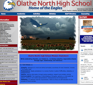
Good and Bad websites

Excessive background noise, just look at all those ads! Some of them you can't even tell if they're ads and they look like they're part of the content.

This site has hardly any background noise! AAAAAAAAAAAAAAAAAAAAAAAAAAAAAAAAAAAAAAAAAAAAAAAAAAAAAAAAAAAAAAAAAAAAAAAAAAAAAA!!!

Is there something I'm supposed to be able to click on?

Very clearly, I can click all of that red text. Thanks SCP Foundation!

What? What is all of this stuff supposed to be organized into? I get a headache looking at this site.
(Plus, I really don't like memes)

Very well organized, you can clearly tell what's what. No headaches.

Good old Memory Alpha. Making excellent usage of Conventions to help make the site more fluid.


Thursday, October 1, 2015

Don't Make Me Think - Unnecessary thinking

What is outlook.com? Why does it say in the classroom? What is Explore?

Where do I search for stuff? Where do I view the school calendar.

Why is Money highlighted? Why would a news site have an opinions section?

Tuesday, September 29, 2015

The Paint Place Project

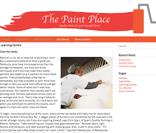
This project was a simulation of a client project. We were given the specifications and guidelines for a website to create for a made up Client named Peter Piper, with his independently owned business called The Paint Place. We also were tasked with creating our own logo for The Paint Place, I used the logo I made as a banner for the website.

We started off with finding out what the "client" wanted his website to contain, and what he wanted it to look like. We then planned out what our website's design would be on a piece of paper by sketching it, along with the logo as well. Once I finished sketching, I used Adobe Illustrator to create the logo for my site, and then used Wordpress to find a theme similar to that which I designed, and created a Child Theme based on that theme to use for my website to make it look more like I wanted it to look.

During this project I learned about how to make the menus and side bars contain certain content that I wanted them to have. I also now better understand what to expect when working on a website or other project for a business client.

There are some certain small parts of the menu that I would have liked to have made somewhat differently. If I could I would have made more posts, but wasn't exactly sure what to post about, so they ended up being mostly just random gibberish about quality and customer service. Being that this is only a made up scenario, not all of the things on my site are 100% serious of course, and in the event of an actual client project I would take a much more serious attitude towards the project. I am however, pleased with the overall outcome of the website.


From this project I have gained the experience of having to create a website based on more specific guidelines. I have created a much better method of planning the design of a site. I have developed a better understanding of creating a child theme for Wordpress as well, and also have a better understanding of creating multiple pages for Wordpress.

Overall I feel I did a good job with the site, and I think I will do even better on the next project that I receive.

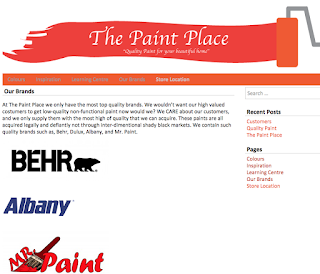
Here are the remaining Images from the other pages of the Paint Place Site:


Friday, September 11, 2015

Wordpress

As of late, we have been using the software known as Wordpress. Recently we were asked to use the internet to search for the answers to various questions relating to Wordpress.

What is the purpose of wordpress.com & wordpress.org?

Wordpress has two different sites, wordpress.com and wordpress.org. WordPress.com is a fully hosted website, where you simply create the website's design in your web browser. WordPress.org to compare, is a more hands-on, do it yourself system, in which you need to host the website yourself. The advantage of this is you can build your own CSS and PHP files to edit your website more directly.

How did Wordpress originate?

Wordpress was created from the want to create an easy to use personal publishing system based off of PHP and MySQL. It is made in the hopes of focusing on user experience and web standards to create a tool different from anything else.

What is Wordpress based on?

A simple question really, that probably didn't need such a big header. Wordpress is based off of PHP and MySQL. It is also the official successor of a software called b2/cafelog.

What is CMS?

CMS stands for Content Management System. A CMS is a piece of software that allows publishing, editing, and modifying content. It is what allows people to manage their work content, instead of having a massive flowing sea of countless lines of code.

What large, well-known sites use Wordpress as a CMS?

What percent of the top 10 million  websites use Wordpress?

Surprisingly, more than 23% of the top 10 million websites uses Wordpress. Amazing isn't it?

Other Commonly used CMS platforms.

Wordpress obviously is not the only CMS. Along with it, there are other popular CMS platforms, for example, a couple of them would be Drupal, and Joomla.


That's all for now, thanks for reading.

Monday, August 17, 2015

Stock Image Sites

For our first project we went to four different stock image websites and were to collect an image of something that we chose to search for on the site. I initially tried to find images of Germany but when I could not find a picture for one of the sites I instead tried coffee. Turned out one of the sites somehow had no pictures of Coffee. Out of my small fit of anger I typed 'BEAR' into the search bar of one of the sites, and thus decided to use bears for my images

Sites

The sites we used were as follows:
http://www.pexels.com
http://gratisography.com
http://www.morguefile.com/archive
https://unsplash.com

Images

Pexels.com

This first image is from the site pexels.com.
This site, has the highest amount of images of the other sites I believe, although am not certain.
Although it has the issue of a bad system for downloading, you have to click on the image, which redirects you to a different site, where you then have to select download, which instead of downloading the image, simply opens the image in a new tab.


Morguefile.com

This image is from the site morguefile.com. I feel that this site has the best images. Be that in quality and content, I mean seriously, it's Smokey the Bear! None of the other sites had that. The only issue I had with the site is that its hard to notice the download button, which only appears when you mouse over an image, and then it displays an icon that could be mistaken for not being a download icon.


Unsplash.com

Here is the image that I downloaded from the site unsplash.com. This site had a good search system as well as the most obvious download mechanism, simply it had a link which said "Download" underneath the image that you click. However, the site is not very well formatted compared to the other sites, and you cannot have very many images on the screen at once, because of the size of the images.


Gratisography.com

Here is the final image, which I got from the website gratisography.com. This site had an easy download system like the previous site. Personally this was my least favourite site, the biggest issue being that it for some reason had absolutely no search bar, which was rather frustrating.


Conclusion

Next time I need to find an image for a project, I will probably go to morguefile.com, because it is by far the best in my opinion, with the best images. It also is easy to use with an obvious search bar, and once you know where the download thing is, you're good. Plus, Smokey the Bear just seals the deal. 

Thursday, May 21, 2015

The End


My Website


As our final project, we were assigned to update our index on our websites. On mine, I added small descriptions to the bottom of the page. I also added a picture and some small info about myself.


Favourite Project


This year my favorite project was probably the Semester 1 final. I had a lot of fun with this project because I made the complete history of Matto (which needs to be updated). I also got to show off all of my flags which was fun to do as well.


Summer

Over the summer I'm going on a few trips. With my mom sometime during the summer we are going to go to New York to visit family that is there. With my dad, I might be going to the United Kingdom in June to see TankFest as well as going to the Imperial War Museum and some other areas in the UK. I might try to get a job, but I don't know yet. I'll also probably do stuff with my friends throughout the summer.

Next Year

Next year I will still be in e-Comm. I am going to go into Web Design next year. I have enjoyed Web a lot, and I have found it easier to understand than animation in several parts. I enjoy doing stuff with web so I'm going to continue on with web.

Wednesday, May 20, 2015

Animation Finale

This is the final project for animation. In this project we were required to combine our skills that we have accumulated over the year. In our project, we used the green screen Maya, and AfterEffects.

Storyboard

The first step to our project was to concept an idea. We initially did so by scribbling meaningless words and small drawings onto a piece of paper. When we came up with an idea that we all agreed upon, we grabbed a storyboard paper and drew out all the scenes that we would have in our film.

Filming

The next important step was to film the scenes that we needed in front of the green screen. Without any background or editing, the footage looks rather silly, but I'll put it in anyway. The way the green screen works is that when we film in front of it we can edit out all of the green easily, and then put in another background that we want to have in place of the green screen. Here are the two scenes that we recorded from the green screen that we ended up using.
Like I said, they look rather... odd, when they aren't edited in AfterEffects.

Space Ship

While we were working with the green screen and trying to get time to film, another member of our group was in the animation room working on creating an important asset to the film, the ship that comes down in the video to pick up the character. 

Backgrounds

Once we get the green of the green screen removed, we replace the blank background with a different background. By doing that we can make it look as if the character is on a different world, which is exactly what we did with the image that we used. Below are the three images that were used in our video.


Knowledge

This project required us to use most of our knowledge that had been accumulated over the year with animation. During the project, while we were waiting to get use of the green screen, another member of our group was working on creating the spaceship in Maya. I am mostly pleased with the end result of the project, there are a few things that I would have done different, one being the beam that was used on the space ship to make it look like it was abducting Josh. In the video it was a very sharp shape, what I should have done was add a feather to the mask that I used to make it bleed into the background better and not have a sharp line on the edge. Other than that most of the project was done  very well and there are few things that I would change.

Unfortunately the video size was too large, and could not be uploaded to this blog because of size limitations.

Monday, February 9, 2015

3D Animation with Maya

For the past few months we have been working in the 3D animation software called Maya. We have created a large amount of projects, of which I will share now.

Polything Project
The first of these projects is called the "Polything". With this project we learned how to use the various different lighting tools that Maya has to offer. The Spot light acts like how it's name implies, a spot light, you aim it at the place you want to light and it will light it like a spot light or flash light would. The Point light is like a light bulb hung from a wire, it is like a point of light that lights up the area all around it. The ambient light is like sunlight in that when you place an ambient light it's like having a giant light source like the sun that creates shadows from one angle across the entire project area.

Hammer Project
In this project we created a Hammer using the Cut Face and Extrude tools. The Extrude tool allows you to pull out from the face to make it into an extension of the model. The cut face tool can be used to cut the face of an object, and create two separate extrusions with the extrude tool.

Ice Cream Project
In this project we created the scene of an Ice Cream Parlor. To create the effect of the ice cream really looking like ice cream we used a Bump Map. Bump maps make an object look like it has a texture to it when in reality it is still flat. We also created a video that looks like it seamlessly loops. To do this, we have the ice cream rotating on the platform, and instead of the platform doing a complete 360 degree rotation it does a 359 degree rotation, so when the video loops it goes from 359 degrees to 0 degrees, which is the same as 360 degrees, so it does not look like it has a brief pause.

Bouncing Spheres Project
In this project we took three spheres made to look like a golf ball, a tennis ball, and a bowling ball, and made them bounce. To do this we needed to use keyframes. Keyframes in Maya work very similar to Keyframes in AfterEffects and Photoshop. You set the position of an object at one frame and make a keyframe, and then set the position of it at a different frame and make another keyframe, and Maya will automatically plot where the object needs to be in all the frames between. We also used the Graph Editor to help show what height the ball was at which frame in the animation.

Cup Project
For this project we had to create a cup using the Curve and Revolve tools. The first thing that was needed to be done was use the curves tool to create half of the outline of the cup's shape. After that we used the Revolve tool to pretty much take that half outline and bring it around in a 360 degree rotation, creating the complete cup. This object was not made up of Polygons, but instead was made up of NURBS, which instead use vectors to calculate the shape of the object.

Salt Shaker Project
In this project we used the Circle Curve and Lofting tools to create a salt shaker in Maya. First we used the circle tool to create a circle, and then edited the shape of the circle to make it be a different shape. Then we copied the shape and made multiple of them at different heights and of different sizes. Then we used the Lofting tool, which kind of wrapped around the shapes created with the circle tool to create a completed object.

And that's all. Over all we learned how to use a variety of tools which we can use to make various different things.